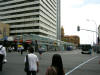
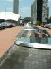
| Britomart Intermodal Facility |
| At the base of Queen
Street, there was a very nice intermodal transit facility that has been
built perhaps in the past five years (?). The building to the left
with the clock is the former main post office, now re-used as the terminus
for a regional rail system. Immediately across from the station, and
the subject of this photo, is a massive cantilevered shelter that extends
the full length of the block across from the station. It shelters
passengers from above, but not from the sides, which would indicate to me
that adverse weather conditions come only from above (sun, vertical rain)
and not so much from the sides (like the wind-driven snow that necessitates
enclosed shelters in north America). |
|
|
| |
| |
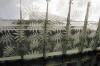
| The glass of the canopy has a beautiful
frit treatment, a mixture of parallel lines and circles |
|
|
| |
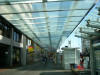
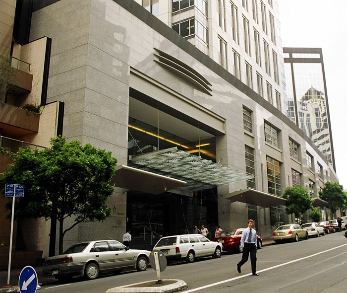
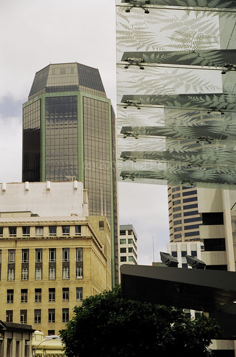
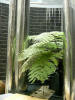
| A digression: while walking about Auckland, I came across
another cantilevered frit glass canopy. I wonder which one came first.
The one at Britomart impresses because of its sheer size - it dominates the
plaza. Also, it's a really ballsy cantilever. But this one
has more a impressive design on the glass - more silver fern. From an
engineering standpoint, the office building canopy is nothing all that huge
- it's easy to cantilever a canopy off a building, when you can
counterweight back into the structure. Cantilevering off a right angle
(like at Britomart) is a different game, though. No counterweight on the
other side, no support cables from above. |
|
|
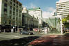
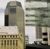
| Toying with composition on this one, quadrilateral
symmetry/asymmetry. I like the second one better. |
|
|
| |
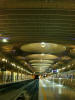
| A day or two later, I decided to take a longer look at the
train station. The station is a brilliant execution of adaptive
re-use in an urban context. The original building was a central
post office. In most urban re-use instances, a train station is being
changed into something else, usually some horrible shopping arcade. In this
case, a post office was transformed into a train station. There
is a lot of very impressive engineering involved here. The head of the trainshed was built 'top-down'. Piles were set, the roof beams were
built onto the piles, and then they excavated down to
the railbed level. All in the interests of not disturbing the
neighboring buildings, some of which have historic importance. |
| |
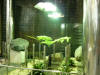
| Between the restored post office and the train shed is a
large glass structure, that brings light, and more importantly, air, into
the train shed. Note the zig-zag effect along the right-side
edge. Each of the glass panels is mounted on a pivot, so that it can
be opened to allow fresh air into the station. Within this glass box in a delightful mixture of
materials and textures. |
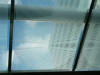
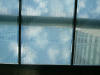
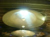
Clouds reflected in the glass The structure is open to the air to allow ventilation. Steel, wood, and frit glass Wire mesh encloses the elevator shaft
I left this image uncropped to give a sense of scale. According to the information boards, the mesh echoes Maori textiles.

Clouds reflected in the glass
I left this image uncropped to give a sense of scale.
|
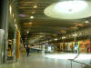
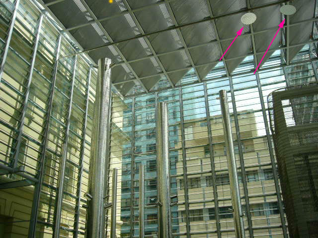
| I repeat one of the images in the above gallery for a
notation. The arrowed circles are light reflectors, with a surface
grid of parabolic reflectors that diffuse the light. The light
itself is projected from below the reflector, in a narrow beam. The
parabolic reflectors diffuse the light across a wide area, without the glare
of direct lighting. What is so impressive about these fixtures
is that they provide light, but the light's source is invisible. The
actual bulb is hidden away somewhere, and the light is focused on the
reflector. So, you get light in a room, but without disclosing
the source. I've seen this approach to lighting twice, also in
transit contexts. The Frankfurt-am-Main airport uses massive lighting
fixtures, with these reflectors attached, for area lighting inside the
terminals. The Bucharest airport uses enormous reflectors of a similar
design, to illuminate the tarmac outside the terminals. I've not seen
fixtures like these in the States. Though perhaps this is more due to the
provincialism of New York real estate and architecture. |
|
 |
| |
| The same material used to enclose the elevator shafts is
also used to screen ventilation equipment located at street level. I
like the fact that the screening does not try to hide what's behind it.
Too often, an attempt at screening results in something uglier that what is
being hidden. The semi-transparency of the screening
acknowledges the necessity of what is behind it, yet the screen integrates
these structures into the station as a whole, through the use of common
materials and proportions. |
|
 |
| |
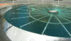
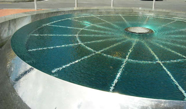
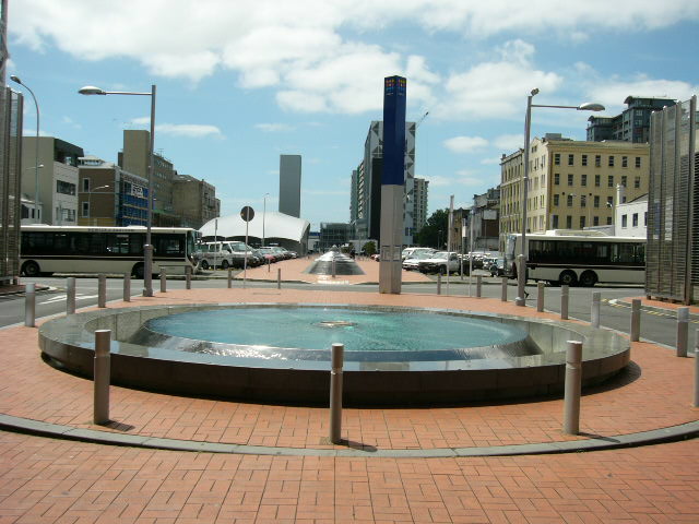
| This installation serves several purposes. It
animates a plaza that would otherwise be the back-end to the post office
building. |
|
 |
| |
- It is a water feature, and as such it resonates the importance of
water to the the City of Auckland. The station is a stone's throw
from the harbo(u)r.
|
|
|
| It's also a skylight. This expresses immense
confidence in the engineer's ability to design a water-proofing system that
is impervious not only to the occasional precipitation, but also a fountain
that is running 24/7. |
|
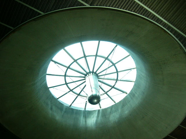 |
| The water amenity skylight is the first of a series of
skylights that continues the length of the platforms, casting natural light
into the station. |
|
|
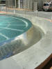
| The grey of the concrete and the steel
mesh is softened by the inclusion of additional water amenities, and that
symbol of New Zealand, the Silver Fern. |
Again, a nice juxtaposition of textures. It takes immense confidence as an engineer to include water in a public space. Water amenities always leak. It's just a matter of time. I suspect the supplemental lighting was an afterthought.
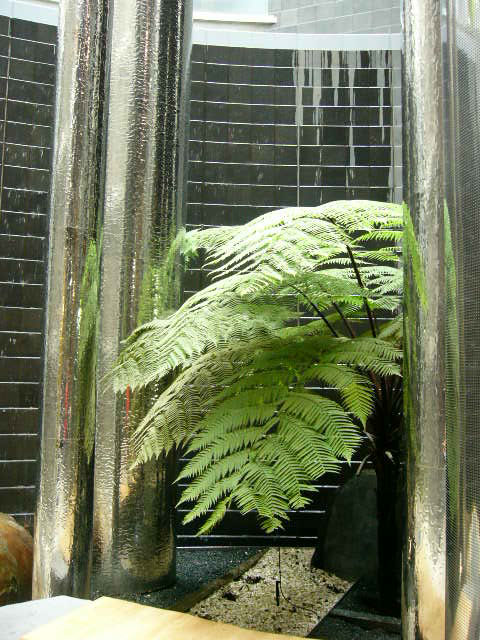
Again, a nice juxtaposition of textures.
|
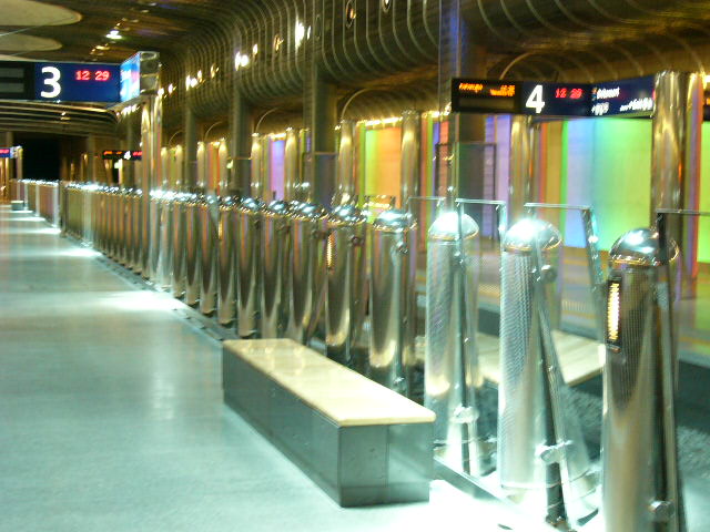
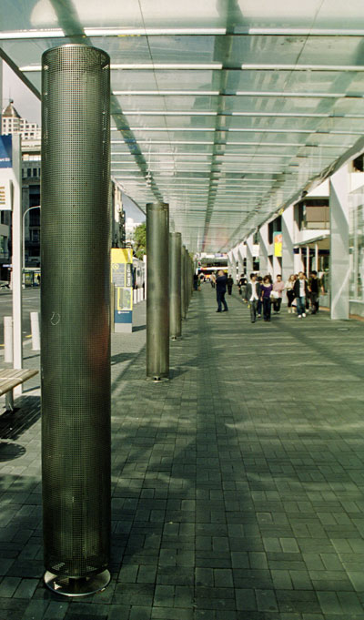
| This is a crappy image, but it's necessary. Remember how
the glass structure at the head of the trainshed is effectively a wall of vents to allow air into
the structure? The rolling stock for the Auckland Rail System is
diesel powered, so the trainshed must have a constant exchange of air.
Each of the cylinders in this row is perforated and connected to a fan
system that continually pulls air through the station. If you hold
your hand close to the cylinder, you can feel a very faint draft of
air into the cylinder. A lot of air is being moved here,
but there are no drafts, no noise. Like the lights mentioned above,
these cylinders accomplish a mundane task of station management while
making their utilitarian identity invisible. Absolutely brilliant. The
cylinders are interspersed with glass panels that create a barrier between
the platform and the track. Not terribly evident here is the
fact that the glass panels are set at varying angles, which undulate in a
sinus rhythm along the length of the platform. The closest
fully-visible panel is tilted towards the camera. The third one back is
vertical. The fourth panel is tilted away. Perhaps in an earlier
version of the design, the glass panels were all vertical. A big
gold medal to whomever had the insight to go back and introduce the changing
angles. |
|
 |
| |
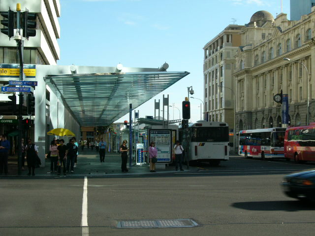
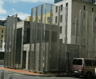
| A nice discovery, made on my third visit to Auckland, three
months later. The above-mentioned cantilevered shelter has a series of
vertical columns, lit internally. The proportions and materials of the
columns echo the series of columns inside the station. Very nice
execution of overall planning. |
|
|
| |
| |
|
 |
| |
| |
| |